Overview
This project was a design exercise for my UX/UI design class (rather than actual work for Instacart). The assignment was to add a feature to an app/website that would enhance its usefulness. I chose to add a dietary preference feature to Instacart, an app where you can purchase items from grocery stores online and have them delivered to your house.
Instacart has basic dietary filters within very specific subcategories of foods, which vary by the store you’re shopping at, and these options disappear/reset when you switch departments, making it difficult and tedious for a user with dietary preferences to find food specific to their diet.
The problem: The basic filtering system is not enough for someone with dietary preferences to efficiently complete a round of shopping. Shoppers need an intuitive way to filter products in order to more easily find products that meet their dietary preferences.
Specifications
- Project duration: 2 weeks
- Team or individual project: Individual
- Platform: Mobile and desktop
- Tools used:
- Figma
- Adobe Photoshop
- Miro
- Whimsical (flowchart program)
- Instacart’s “Snacks” design system
- Google Docs
My Roles
- UX Researcher
- UX Designer
- UI Designer
Deliverables
- Project timeline
- Competitive research, secondary research, user survey
- Persona, task flows
- Feature roadmap
- Style tile
- Low- and high-fidelity wireframes, prototype
- Usability testing and findings
- Final mockup/prototype revision
Project Roadmap
- Conduct competitive research to see how other grocery websites tackle this problem
- Conduct user research to see how users like to use online grocery shopping websites/apps, including what they like and don’t like
- Design a solution that fits within the existing design system and makes sense to users
Competitive Research
I started by researching other grocery shopping websites/apps. This provided a necessary baseline for the structure of the website and got me thinking about what I like and don’t like about each solution.

Each grocer I researched had a different way to find the vegetarian/vegan foods I was looking for, some easier than others. None provided me with an easy, complete way to find all the vegetarian/vegan foods that I wanted to find. It was worth also noting that I was conducting this research around Thanksgiving, and there was no easy way to find vegetarian/vegan foods within the curated seasonal pages.
User Research: Planning
When determining what I wanted to learn from users to inform my design, I widened my scope based on existing filters on some of these websites, such as gluten-free, Kosher, etc. so that my design would cover all the bases.
Research objectives
- Understand what users want out of an online grocery shopping experience
- Understand how users find the foods they’re looking for
- Understand pain points that users face in this process
Research methods
- User survey of twelve questions
- Four participants aged 26-30 who have dietary restrictions and use online grocery shopping sites/apps
A few example survey questions:
- What are your dietary restrictions?
- Is it easy or difficult to find food that fits your diet on your preferred grocery shopping website/app? Why?
- Is there a feature or a specific page that would make it easier to find the type of food you want to buy?
User Research: Results
Key findings:
- One user was vegan, one vegetarian, one pescatarian, and one does not eat meat or dairy but does eat fish and shellfish
- Two users said it is mostly inconvenient to find the products they will actually buy
- Two users mentioned frustration when products are not properly tagged/categorized
Based on this research and what I learned from looking at competitors, I took a linear approach to define a persona and user flows.
Persona
To develop the persona, I took traits from each participant and distilled them into one hypothetical user. The resulting persona covered the scenarios of my survey participants.
The Online Grocery Shopper
Goals/Needs:
- Be able to easily find and purchase food within set dietary parameters, for delivery at home
- Ideally, receive suggestions for products that are within dietary parameters
Frustrations/Fears:
- Spending too much time finding food
- Navigating an experience designed without dietary restrictions in mind
Task Flows
I made a task flow based on how I pictured my survey participants to best be able to find the products they want:

Then I realized I had missed something.
Initially I had interpreted one participant’s answer of no meat or dairy but fish and shellfish as “pescatarian” — but then I realized many pescatarians eat dairy, so this participant actually had their own unique diet.
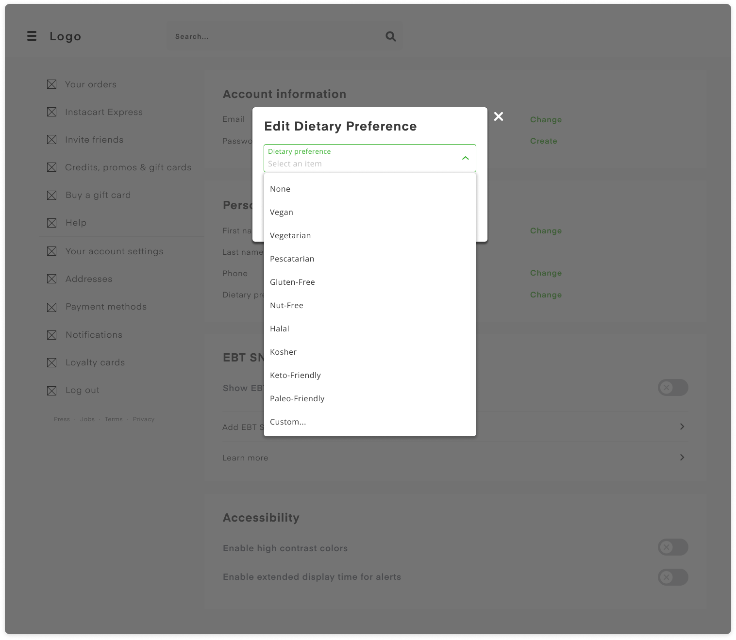
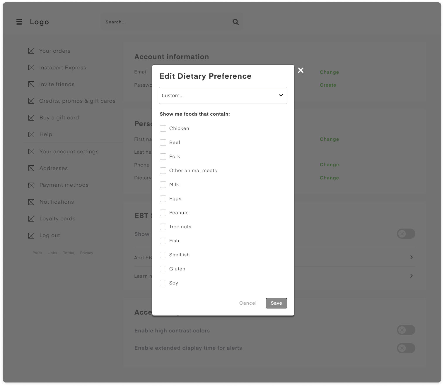
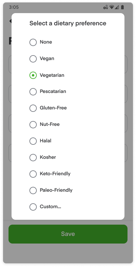
I had been picturing a simple dropdown with certain diets (i.e. vegetarian, vegan) as is common on competitors’ websites, but the user who didn’t fit into a specific category made me rethink my whole approach. I realized that there were likely other diets that my solution should include — for example, what if a vegetarian has a specific food allergy? This meant that to meet their dietary preferences, I would need to have individual ingredients selectable. I made a second flow to account for this:

I decided to conduct secondary research to get more information on diets.
Secondary Research
I started with search terms such as “common diets in the US” and realized that none of the competitors had a comprehensive filter that could accommodate all shoppers’ diets. I also found some interesting statistics:
A Gallup poll in 2018 found that 5% of participants were vegetarian or vegan
Foodallergy.org estimates that 10% of US adults have at least one food allergy
The CDC found that the prevalence of food allergies in children increased significantly from 3.4% in 1997-1999 to 5.1% in 2009-2011
Market research firm Packaged Facts found in a survey that 36% of consumers identify as “flexitarian”, meaning they eat meat but also mix up their diet with vegan or vegetarian meals
This information helped me to refocus my efforts for the feature: it would need to cater to people of more diet types and combinations to be effective. (I also realized I could have done more thorough secondary research earlier in the UX process.)
Low-Fidelity Wireframes
I started by sketching some ideas for the mobile flow and thinking about how I could accomplish my goal using different UI elements like checkboxes and slide toggles. I tried a few different options but wasn’t in love with any of them.
Style Tile
I made a style tile based on the website and Instacart’s “Snacks” design system. Unfortunately the website elements were inconsistent with the design system specifications in several instances, such as text sizes and colors that were slightly off. In these cases, I went with what was on the website.

High-Fidelity Wireframes
I started making high-fidelity wireframes to see if I liked these selection UI elements any better with the correct colors and visual characteristics, but I still wasn’t happy with the design. I looked deeper into the Snacks design system and found a “selection pill” element, which seemed perfect for my use. I had seen these before in product filtering systems on shopping websites, so I figured it would make sense in this context. I think discovering this element was my favorite part of the project because I was uncertain about my solution before I found it.


Usability Testing
I made a prototype with the high-fidelity desktop wireframes in Figma. Five participants aged 25-30 tested the clickable prototype in remote usability tests via Zoom. I had each participant share their screen and perform the task flow of changing the diet settings to reflect an organic vegetarian diet. I took notes on their behaviors and asked them questions about why they did things in certain ways, e.g. “how did you decide to change the diet settings this way?”
Results:
- All users were able to complete the task flows, though some had difficulty navigating through the settings menu
- One user initially didn’t see the hamburger icon in the top left of the homepage
- One user asked whether a selected button indicates that it would be included or excluded from results
- Three users mentioned it would be helpful to have a “vegetarian” or “vegan” button
- All users appreciated the functionality of this feature and had ideas for additional capabilities/new features
Affinity Map
With the notes of my observations from user testing I created an affinity map in Miro to easily visualize suggestions and feedback. There were some important issues that needed to be solved.

Final Result
After incorporating some suggestions, fixing the issues, and an iteration of polishing, I was happy with what I ended up with. I ended up adding a link on the homepage that makes it easy to change your dietary settings. I also added helper text to the modal options and created buttons for vegan, vegetarian, and pescatarian diet presets. Click here for the Figma prototype (desktop).
Potential Next Steps
- Implement a plan to measure success
- Complete another round of usability testing with more participants to see if any issues persist
- Come up with more ways to make selection even more clear regarding what will be included/excluded

Conclusion
Overall, I think that this level of granular product categorization/filtering is crucial for accessibility when shopping online for groceries. One of my user testing participants said “I can’t believe this isn’t already implemented,” which shows the need for something like this to help shoppers find what they want quickly and also easily explore suggested products. I consider my design to be a solid solution to the problem, but it could be further refined using metrics and additional testing.


